Partner Article
New look website for Little Tikes
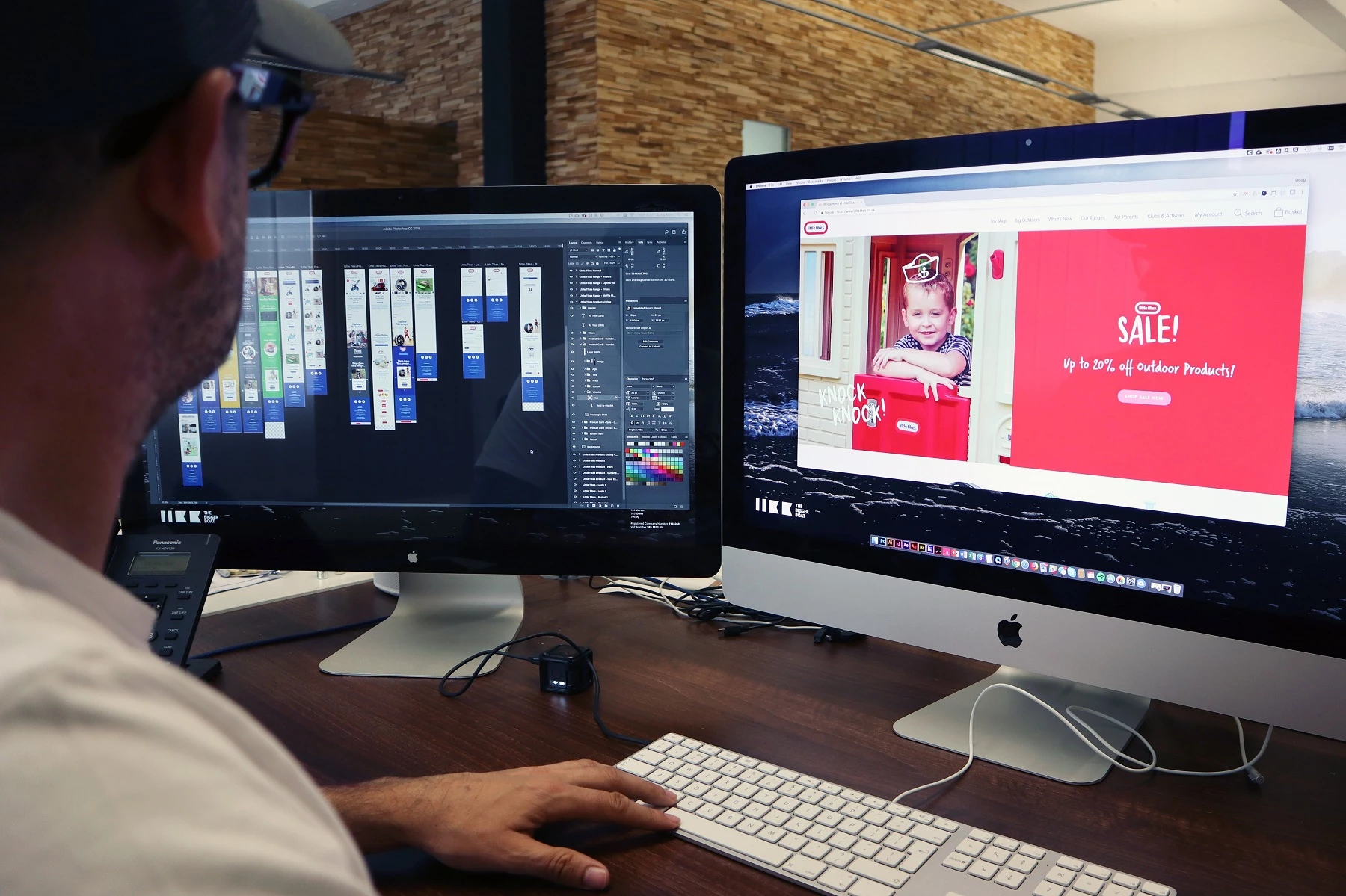
One of the UK’s most renowned and trusted toy manufacturers – Little Tikes – has undergone a complete website overhaul, to propel the company forwards in line with the current digital climate and reflect its updated direction and brand values.
Designed and developed by Yorkshire-based creative agency The Bigger Boat, the online platform reflects the best practices of design and digital, and amalgamates a range of existing information from various partner sites into one ‘brand hub’. This both supports retailers and enables visitors to easily access full, detailed product advice for the entire Little Tikes range of merchandise in one central location.
To further revamp the site, a range of unique typography has been introduced throughout – alongside custom drawings – to give the platform a fresh and modern feel. The homepage has also seen the integration of user-generated content, with social media now feeding into it via Facebook and Instagram, to provide the target audience – millennial parents – with a more engaging experience.
Reflecting on the design, creative director Doug Main said: “In addition to the new website we also helped to reposition the Little Tikes brand online. We updated the logo to make it simple and flat – as opposed to skeuomorphic – and refreshed the colour palette. The creation of bespoke hand-drawn doodles helped inject personality and fun to imagery throughout the site.”
The six-month project – which involved over 500 hours of manpower from the multi-disciplined Bigger Boat crew and was strategically timed to launch at one of the quietest times of the year for the toy arena – was designed via a mobile-first approach. The call to action buttons on each page are even positioned in a more accessible place for a phone user’s thumb.
Andy McCaul, managing director at the agency said: “The fact that 80% of people use mobile technology when visiting e-commerce websites meant that we had to cater for this audience first and foremost when planning the site – whilst still delivering a rich desktop experience. We tackled the brief from a data-driven perspective to ensure that we delivered the best possible UX.”
He continues: “This was a huge project for our 12-strong team, and we are extremely proud of the finished article. The move away from stock shots and a custom style of text has made the site more eye-catching and vibrant, and given the Little Tikes team a solid platform for growth.”
Developed using Wordpress and WooCommerce to better support future development and provide enhanced reporting functionality, early statistics are already showing an improvement on the previous offering, with the average order value up by 30%, the goal conversion rate up by 130% and a 35% increase in engagement.
Michelle Lilley, head of marketing at Little Tikes said: “We’re really pleased with our new direction and website, which helps to bring our exciting range of toys to life online. Importantly, it delivers on our key objectives – to engage millennial parents, become a brand hub and support our retail partners. We’ve had some fabulous feedback globally and our new brand style is now being rolled out internationally.”
This was posted in Bdaily's Members' News section by Katie Mallinson .
Enjoy the read? Get Bdaily delivered.
Sign up to receive our popular Yorkshire & The Humber morning email for free.


 How businesses can reduce workplace safety risks with custom solutions
 Tech firm unveils jobs plan after £530,000 backing
 SMEs urged to think big at Newcastle event
 B Corp is a commitment, not a one-time win
 Government must get in gear on vehicle transition
 A legacy in stone and spirit
 Shaping the future: Your guide to planning reforms
 The future direction of expert witness services
 Getting people into gear for a workplace return
 What to expect in the Spring Statement
 Sunderland leading way in UK office supply market
 Key construction developments in 2025